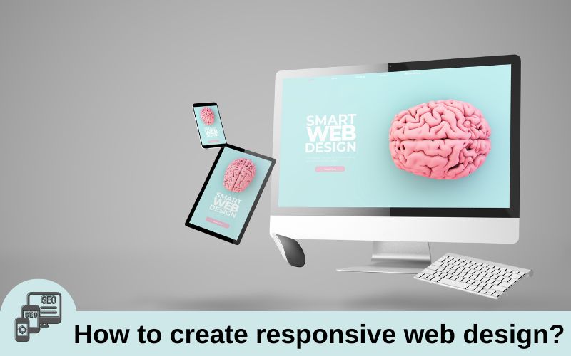
A combination of techniques known as responsiveness enables web sites to change their design and layout to accommodate various screen sizes, resolutions, and other parameters. It is an idea that changed the way we design multi-device web. Responsive web design is a good solution to deal with multitude of screen sizes and resolutions as a digital designer.
We use different devices. It applies to online shopping, watching movies, social media, and various other activities in the same way. We expect websites to run smoothly across all devices no matter what you’re doing. This is where responsive web design comes in. It brings many advantages to your Lives.
The term is not new but is now more relevant than ever before. Now, websites can no longer afford to make mistakes. If the page loads slowly customers will go elsewhere. If it looks good on desktop but is messy on mobile, you will lose your customers. 94% of users list web design as a key reason for trusting or not trusting a website.
A trainer from web design institute in Delhi shares an insight on responsive design in this article.
Why to use responsive web design?
More Mobile Traffic:
The use of smartphones has increased and people can now access the internet at any time in any place. Nearly 77.77% of web visits are from mobile devices as of May 2024. If your website can adapt to the mobile screens of any device people use, it can bring you more traffic. Researchers predict that the upswing in smartphone usage will only continue because of why implementing responsive web design in your business is so crucial.
Fewer maintenance needs
You don’t have to manage two versions of your website separately as you do with adaptive websites. Less time and money are spent on Website Maintenance in the case of responsive websites.
Lower Bounce rate:
Responsive web design means a better user experience. Is your website easy to navigate? if so, there’s a higher chance that users will spend more time there. Pretty logical!
Moreover, responsive websites load faster. If it takes your website more than three seconds to load, users will quit and are unlikely to ever come back. Developing a website with responsive design is quite more expensive but once done, it will produce long-term Savings in web development fields.
What is Responsive Web Design?
However now, smartphone usage is higher than ever. Web designers can just create website that seamlessly scales content and elements to fit any screen. This is what we call responsive web design. Implementing responsive web design into your website means each user despite their device will have a flexible experience. Layouts and presentation might adjust according to the size of your screen but your website and the information on it will remain the same.
The main purpose of responsive web design is that users don’t have to pinch-zoom or take any extra steps to see your website’s content. Their experience will be uniform across all devices without any distortion. Responsive web design allows websites to shape content and images for both small and large devices. It does this by using flexible grids, flexible images, and media queries. By syncing your layouts, graphics, and images to each user’s device, the website’s liquid layout scales to fit the screen accessing it.
How can we ensure the scalability and adaptability of our interfaces?
To handle that issue, designers came up with two primary approaches for designing across a diverse range of devices: Adaptive and Responsive design.
| Adaptable Web Design | Responsive Web Design |
| Adaptive design is all about the creation of dedicated layouts for specific screen sizes. Adaptive design employs multiple versions of our design. | Responsive design utilizes one layout and adjusts the content, navigation, and other elements of the interface to fit the user’s screen. |
| Adaptive design requires more effort as it also allows you to create dedicated and more optimized (to the given platform) experiences. | With a responsive approach, you are essentially creating a set of rules that try to adapt your design to a wide variety of use cases. Less time and money will be spent. |
Viewport Meta Tag:
What is Viewport:
A viewport is the size of the window that you’re viewing your website on. It’s just the size of your browser that can be the ‘full size’ of the screen or you can shrink your browser. The portion of the browser that you’re viewing the website is actually the viewport on your desktop.
For example:
A Mobile screen could be about 360 pixels in width but that doesn’t necessarily mean that the viewport on the browser that you use on that mobile is going to be 360 pixels in width. Even though it seems that way. When you open a website on different devices, the viewport size changes along with it.
To solve the problem of shrinking away a website on mobile phones and smaller screen sizes, use viewport <meta> in HTML document under <head> section.
We’ll add it in a <meta> tag with two different attributes that is width and initial scale.
<meta name="viewport" content="width=device-width, initial-scale=1.0">We have set ‘width’ equal to ‘device-width’ so that instead of shrinking everything down, try to simulate the different sizes of the screen. Whatever your device’s width is going to be used for the media queries.
The value of the ‘initial scale’ is ‘1:1’ and this indicates that the page is not to be zoomed in or out when we load the page first.
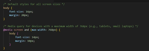
Media Queries in CSS
The most important thing for responsiveness is a media query for which you have to write some additional code.
In CSS3 the name of ‘media rule’ which was introduced in CSS2 was changed to ‘media query. Media query is used to make responsive designs which allows developers to build websites that adapt to different devices and screen sizes. Here is the syntax for writing media queries:
@media not/only MediaType and (expressions) {
CSS-Code
}
For example:
Key Components of Media Query:

- @media: It Indicates that we are writing a media query.
- Media type: We write this to specify the device on which you want to write the media query. Other media types can be All, Print, and Speech Devices.
- Not/only: For example: We are writing ‘only screen’ which shows, that it will be applied only when it is on the screen.
- Not– Don’t show this media query on this particular media type.
Expressions such as width, height, orientation (portrait and landscape), and resolution (screen resolution) can be mentioned as conditions for the viewport.
@media only screen and (orientation: landscape) {
CSS-Code;
}
Here is a practical application of media query:
Media queries are explicitly used while writing raw CSS and making projects.
Concepts of breakpoint:
A range of pixel widths is called a breakpoint. Breakpoints are generally defined under CSS media queries which ensures whatever design we make; websites look correctly adapted to that particular screen size.
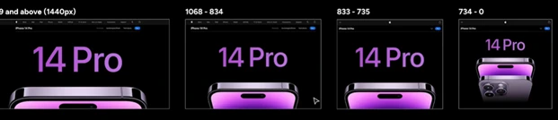
Under standard breakpoints, the smallest breakpoint is 320 which means (0 to 320). This is considered as an outdated screen size and there is a very tiny percentage of people who are using screens width of 320 pixels.
- Basically, start with 360px for Android phones and then 375px which are pretty much the ordinary mobile portrait breakpoints.
- For mobile landscape mode, it is 425px so if you rotate your phone, you will get a lot more screen size in terms of width.
- For tablets, the screen width is 768px and for smaller laptops it is 1024px. For further large desktops is 1440px and above.
- The recommended industry practice is to have four breakpoints. The way we would Define it is:
Mobile portrait>mobile landscape> tablet>laptops
Flexible Images:
flexible images, often also called adaptive images. It responds to different viewport sizes and display resolutions. The whole idea of responsive images is that we provide a multitude of image size options to browsers and devices so that we can choose which image to download Based on the viewport size.
By default, pictures on the web are not responsive. If we try to change the size of my browser, this picture does not move but almost like magic with adding some HTML and some CSS we can make this picture catch the size of our browser.
To start the responsive process, we have to put some meta information inside the head and tell the browser that our width is the overall device width.
For this, we will add <meta> Viewport in <head> section of HTML document.
<meta name="viewport" content="width=device-width, initial-scale=1.0">Next, we will come over to the custom CSS section.
To set our picture to be fluid or responsive, we will use the image tag and set the width as 100% and height as ‘auto; which allows us to properly scale the picture.
img {
Width: 100%;
Height: auto;
}
The picture will grow and shrink based on the overall size of the browser. This is the change that we are going to notice after applying the above CSS.

We essentially want only the designated pictures to be fluid. For this, we can also add ‘class’ to our image. This allows us to pick and choose which picture we want to be responsive.
<picture> tagThis is an important feature used for responsive web designs which allows us to deal with images of different sizes, screen widths, and image formats. The <picture> tag works with <img> tag which additionally contains <source> tag inside it. This HTML element is pretty new and it’s not fully supported in all browsers.
Here is an example of how a picture tag is used.
<picture>
<source srcset="image.webp" type="image/webp">
<source srcset="image.jpg" type="image/jpeg">
<img src="image-fallback.jpg" alt="Example image">
</picture>
In the example above, the media query indicates the conditions in which various images are to be shown.
For example: As shown above, “image-large.jpg” will be shown on screens that are 800px wide or more, while “image-small.jpg” will be shown on smaller screens.
Fluid or Responsive layouts:
A fluid layout uses relative measurements and it responds to the width of a viewport between your media queries. On the other hand fixed layouts use static measurements and they do not respond to the width of the viewport. It’s always better to use a fluid layout because you have varying different screen sizes and you want to capture them all whereas a static or a fixed layout will capture certain breakpoints.
For example: If you have written 23% in width and try to reduce the size of the browser or the viewport, you can notice that the things will get smaller but they’re still all 23% in width. This is what fluid layouts are. They are responsive to every screen width.
.container {
width: 90%; /* Fluid width */
margin: 0 auto;
background-color: #f2f2f2;
}
.box {
background-color: #4CAF50;
color: white;
padding: 20px;
margin: 10px;
flex-basis: 30%;  /* Fluid column */
}
Responsive Frameworks:
A framework is just a set of code practices that are bundled together in some kind of package that can help us deal with a particular problem and inside of the package could be HTML files, CSS files, JavaScript, or other files for different languages depending on which we use.
A framework aims to make a particular task much easier for the developer, and one such type of framework is a fluid responsive framework. It aims to create a spot to make creating responsive websites much easier. A few examples of the responsive forum are ‘Skeleton’, ‘Foundation’, and ‘Bootstrap’ which is the most important one. There are many others as well.
The core aim of Bootstrap is to make responsive websites easily and it comes bundled with a fluid grid system based on CSS which handles a lot of the responsive code for us. We take advantage of these CSS rules by just adding classes into our HTML and we don’t have to write any extra responsive CSS.
It also comes with other UI features such as a drop-down menu, sliders, pop-ups, and lots of different features as well.
Here, we had a brief of how the bootstrap framework works and helps in responsive web designing. Likewise, other frameworks also come with different features which can also be used in the same way.
We have discussed a lot of things above but grasping everything in one go is not an easy task. You all have to be consistently going through all the concepts. But, if you still need any further help or want to learn web development in detail, you can reach out to our skilled web development course mentors in ESS Institute Dwarka, you will be working with some real-world problems and projects as well. We know the learning curve is quite steep but our team is constantly working to make things easier to learn for all of you.
Be consistent and keep growing!