
Bootstrap in Web development?
The well-known HTML, CSS, and JavaScript framework known as Bootstrap is used to create responsive and mobile-friendly websites. The most well-liked HTML, CSS, and JavaScript framework for creating responsive and mobile-friendly websites is called Bootstrap. Utilization and download are both completely free. It is a front-end framework used to make web development simpler and quicker. It offers design templates for typography, forms, buttons, tables, navigation, modals, image carousels, and many other things that are based on HTML and CSS. Plug-ins for JavaScript are also an option. You can easily construct responsive designs thanks to it.
Why do developers use bootstrap for web applications
Bootstrap, the easy-to-use framework for web development with a huge list of ready to use elements give enough reasons to use it. Some of the reasons are given below:
- Mobile first approach – Bootstrap 3’s framework uses a mobile-first approach and includes mobile-first styles throughout the entire library rather than in individual files.
- Browser Support – All widely used browsers are compatible with it. Simple to use; anyone can start using Bootstrap with just a basic understanding of HTML and CSS. Additionally, there is good documentation on the Bootstrap official website.
- Responsive design – Bootstrap’s responsive features for Desktops, Tablets and Mobiles makes it a simple and easy to make all device compatible web applications. The fact that it is open source is also a plus.
How to use bootstrap in any project?
In any project we basically use the already defined classes and modules by either downloading them into our web application or by fetching them from CDN
To do so, following are the steps to be followed:
- By downloading the bootstrap framework
- The entire directory files are available to download on the bootstrap official website
- Now just extract the directory to the root folder of your application such that it becomes bootstrap folder containing all the required bootstrap files
- Now in all the pages of your website/web application include the links for:
CSS file
bootstrap.min.css in the head section of the HTML code
JAVASCRIPT file
jquery.min.js, popper.min.js, bootstrap.min.js, in the end of the body section of code
- By accessing it through CDN
CSS: Copy this stylesheet linkin the the <head> section of HTML file.
<link rel=”stylesheet” href=”https://maxcdn.bootstrapcdn.com/bootstrap/4.0.0/css/bootstrap.min.css”rel=”nofollow” integrity=”sha384-Gn5384xqQ1aoWXA+058RXPxPg6fy4IWvTNh0E263XmFcJlSAwiGgFAW/dAiS6JXm” crossorigin=”anonymous”>
JS: Copy this stylesheet before the end of the <body> section of HTML file.
<script src=”https://code.jquery.com/jquery-3.2.1.slim.min.js” integrity=”sha384-KJ3o2DKtIkvYIK3UENzmM7KCkRr/rE9/Qpg6aAZGJwFDMVNA/GpGFF93hXpG5KkN” crossorigin=”anonymous”></script>
Bootstrap Grid System
Bootstrap is frequently used to create layout and content organisation. Using HTML and CSS to quickly and efficiently generate a consistent layout is a very useful technique in web design. As the device or viewport size rises, the flexible, fluid grid architecture appropriately adjusts up to 12 columns. It has sophisticated mixins for creating more semantic layouts as well as preset classes for quick layout options.
Basically to make a web application responsive, this framework takes a screen as a grid with 12 column on a big screen and depending upon a screen size and the columns are contained in a grid of different sizes on different screens
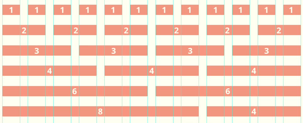
Grid Classes: The Bootstrap grid system has four classes that can be combined to make more flexible layouts:
- xs (<576px): For Portrait Mobile Phones.
- sm (>=576px): For Landscapes phones
- md (>=768px): For Tablets/Phablets
- lg (>=992px): For Small-sized Desktops/Laptops
- xl (>=1200px): For Larger-sized Desktops/Laptops
Components of Grid System:
Container : – In order to encapsulate our grid system and wrap the contents of the site, Bootstrap needs a contained element. Row elements are referred to as “containers” for the column elements, and vice versa for row elements. The section of the article where we discuss columns will help you comprehend it more.
For a responsive fixed width container, use “container,” and for a full width container that fills your viewport’s width, use “container-fluid.”
Rows :- To ensure proper alignment and padding, rows must be positioned inside either a “container” or “container-fluid.” To arrange columns horizontally, we utilise rows.
Container :- You can create grid columns by indicating how many of the twelve available columns you want to span. For instance, three “col-sm-4” might be used for three equal columns.
Column Resets :- With the four tiers of grids that are accessible, there will inevitably be problems where, at some breakpoints, one column doesn’t exactly clear right because it has more text than the other. There is a command called clearfix that resolves any difficulties with that viewport. After the block where the column isn’t clearing correctly, we simply need to create a div command with the class clearfix.
Say there is a problem with the md and sm viewport. However, if we’re using
it is then creating issues for other viewports (perhaps LG and XS). Therefore, we may either hide all other blocks or limit clearfix visibility to the md and sm block (lg and xs).
Columns Offset: Bootstrap allows movement of columns to the right by x columns using col-<grid-type>-offset-x in the class.
<div class=”col-xs-3 col-sm-4 col-md-6 col-lg-1 col-lg-offset-2“>
Nesting Columns: For nesting columns within a column, we need to add a new row and set of columns. Nested rows should include a set of columns that add up to 12 or less than that.
Elements available in Bootstrap for easy use
Typography
Bootstrap typography makes it easy to create headings, paragraphs, ordered lists, unordered lists, and inline elements etc in a way that would be appealing to the users. Bootstrap provides you a set of styles for typography to ensure consistent and attractive text in your website. It also offers Responsive typography which will going to ensures text scales appropriately on different devices for optimal readability.
Buttons
Bootstrap offers a versatile set of styles for buttons, which makes it easy to create attractive and interactive UI elements. Buttons can be styled as primary, secondary, success, danger, warning, info, and light/dark variants. Sizes can be set to small, default, and large according to the need of the design.
Additional styles under button categories include outline buttons, block level buttons (btn-block), and button groups (btn-group).
Navbar
The navigation bar is at the top of a website or a webpage, which provides you an excellent working responsive navigation from scratch. Responsive design ensures the navbar collapses when we want it to hide from the screen (navbar-toggler) on smaller screens.
Building custom and flexible navigation elements with bootstrap is straightforward.
Dropdown menus (dropdown-menu) and forms (form-inline, form-group) can be easily integrated into the navbar.
Forms
Forms are used to take multiple inputs at the same time from the users. Bootstrap offer “forms” in 2 different layouts i.e. stacked and inline.
Form layouts can be customized using grid classes (form-row, col-*) to align and structure form elements depending on design requirement.
Validation states (is-valid, is-invalid) is feedback for form validation.
Cards
Bootstrap provides useful UI elements that is Cards. Cards support a wide variety of content which includes images, text, list groups, links, and more.
It has a customizable and flexible content container and have some padding around the content. Cards can be easily customized using Bootstrap’s utility classes for backgrounds, borders, shadows, and sizing. This flexibility allows developers to adapt the card design to fit specific aesthetic and functional requirements.
GLYPHICONS
Set of icons, fonts or some symbols offered by the bootstrap. The Glyphicon contains set of 260 glyphs is include.
You can utilise Glyphicons which are not free and require permission, although their developer has made them freely accessible for Bootstrap projects.
Bootstrap tools
Since it is a very popular framework for web designers and developers worldwide, many platforms and tools offer extensive features to build over a bootstrap framework so that people can use these tools to work using bootstrap framework, some of them are listed below:
1. Pingendo – An online playground and a desktop version that runs on Windows, macOS, and Linux are both offered by the Bootstrap 4 builder Pingendo. Pingendo offers a fantastic range of templates to help you get your web design off the ground quickly. You can choose from a variety of theme options for example Restaurant template, an App intro site.
2. Brix – A Bootstrap builder used to create, update, and design responsive user interfaces and websites. The entire cloud-based service created as a quick prototype tool for the Bootstrap framework.
3.Jetstrap – Jetstrap is a cross-platform Bootstrap interface builder between an interface-building tool and a mockup tool adding a little bit of each to the mix. in fact, you’re not mocking up your screens but actually constructing things as you go.The tool is a complete web-based builder and comes with drag-and-drop elements and ready-to-create snippets of decent, clear HTML readily assembled complex parts.
4.Pingrow – With the help of Pinegrow, a desktop web editor, any end user can create flexible websites with live multi-page editing, CSS and Sass styling, and Bootstrap, Foundation, and WordPress component support.
5. Bootstrap studio – Bootstrap Studio is a desktop application, providing drag-and-drop capability and has a good selection of built-in components, including as headers, footers, galleries, and slideshows. Some of the best web development experts and web development trainers in Delhi also prefer bootstrap studio over other tools listed here.
6. Code pen – The most complete coding environment available supporting Bootstrap. CodePen is more than simply a game. Additionally, serving as a shared archive of other people’s experiments.
Conclusion
Bootstrap enables quick, responsive development that is dependable and well-supported by the design and development communities. The benefits of using Bootstrap are growing as the framework develops. It’s probably time to give this framework a go if you haven’t already. As you can see, utilising Bootstrap has a number of advantages. The framework enables swift, adaptable development that is reliable and well-supported by the design and development communities.
Many web development expert believes if a student is able to learn HTML, CSS, JS and bootstrap can start his career as a well paying front-end web developer or even as a freelancer. To enhance your web design and development skills, enroll yourself into the web development certification course by one of the top web development institutes in Delhi