
There are several approaches to web and graphic design, ranging from minimalism to flat design, material design, and the innovative application of contrast. White Space is yet another crucial web design component.The absence of clutter promotes balance and simplicity. By adding spaces and paragraph breaks for easier reading, for instance, it can further enhance user experience. White Space must, however, be used wisely and appropriately. When it’s used insufficiently, a site’s readability and usability might suffer significantly. If you use it excessively, you run the danger of representing the brand in the wrong way.
A UX/UI designer needs to know how the user interface of website or web app is coming. White space tells a difference of premium pricing and normal pricing. You can learn how to manage designs and white space from top graphic design institute in Delhi
In this article, we’ll define White Space, go through its various types, and—more importantly—explain why you should make use of it.
What is a White Space?
The void area around the elements and information on a web page is called White Space (sometimes called Negative Space). It is the white space seen between layouts, lines of paragraphs, paragraphs, other UI components, and so forth. The term “white space” does not always refer to a blank area with a white backdrop. It can consist of any color, texture, pattern, or even a picture for the background. It organizes the pieces and content and helps users to have a better visual experience while maintaining the page’s design balance.
In the words of Wojciech Zieliński, we can say: “Whitespace is like air: it is necessary for design to breathe.”
It provides breathing space to a user when he is working on a product. You can spot several instances of it if you visit The ESS website’s main page:
The extensive white gaps surrounding the ESS logo and the equally spaced gaps between each of the navigation links:

The buffers created around each content block on the main page:

What are the Different Types of White Space?
White Space is usually divided into two categories. Let us discuss them below.
Micro ‘N’ Macro White Space
Micro White Space describes the tiny spaces and buffers placed around information or content. It is used to increase the content’s readability and legibility. Micro white space, for instance, is observed between:
- Words
- Letters
- Paragraphs
- Images or Content in a Grid
- Navigation Links
- Form Fields
On the other hand, larger voids i.e. large gaps without content are referred to as Macro White Space. It is used to enhance website layout and make it simpler to read and navigate. It is found:
- In Hero Images
- Around Call-To-Action Buttons
- In the Margins of a Website
- Around the Logo in the Header
- For Separating the Main Content and Sidebar
- In Images
- Between Sections on a Page
Active ‘N’ Passive White Space
Additionally, white space can also be split into passive and active subcategories.
The term “Active White Space” describes empty spaces that have been purposefully placed on a page to help with traffic flow. The objective is to direct a visitor’s focus down the page or through a procedure until they get to the inescapable conclusion and convert.
Whereas, “Passive White Space” refers to the gaps that appear in design or typography spontaneously. From an aesthetic standpoint, you can choose how big or little these gaps should be, but they will exist whether or not you put them there.
Why Should We Use White Space in Designing?
White Space is a crucial component of any design and for good reason. When properly applied, it has the power to shake up both the business for which the design is intended and the design itself. While aesthetics is one favor, others center on concrete effects on the page’s usefulness. In other words, adding white space dramatically improves the page’s UI (User Interface) and UX (User Experience). It works well for web design, UI/UX design, and graphic design.
Let’s check out the things that White Space boosts in different kinds of design besides the appearance and feel of the page:
In UI/UX Designing
Reduced Clutter
It prevents UI clutter. Nothing seems to outweigh the user since everything is in its correct position.
Grouping of Related Elements
By gathering related pieces in a single spot and leaving a large area around them unoccupied, it offers an implicit method for logically grouping related elements.
In addition to this, it assists in logically separating unrelated items by creating suitable gaps rather than explicitly giving separators.
Highlights Important Elements
When critical action items are made more noticeable by adding space to the screen, the user’s eye immediately picks them up.
Enhanced User Experience
It creates an appealing and simple-to-understand layout to deliver an eye-catching and pleasant user experience. The user experiences a sense of luxury since the gap between UI components functions like a breath of fresh air.
In Graphic and Web Designing
It makes your content easier to comprehend and legible
Whether it’s a little piece of text in a hero picture, a long blog post, or a very detailed product page, you want people to read what’s there.
Correct font sizing will aid in making your text stand out, but it’s the space between letters, sentences, and paragraphs that makes sure they’re easy to read. Consistently using white space enhances readability and makes the information in designs simple to scan.
According to research, using white space between paragraph lines as well as its left and right borders can boost understanding by up to 20%. Micro White Spaces are another name for the minuscule gaps between menu items, lines, and paragraphs.
It Improves Focus
Macro White Spaces, which are large gaps between layouts and layout components, are very helpful in directing visitors across the website and prioritizing the focal area for the user. When you bombard visitors with material all at once, they can find it difficult to concentrate on just one item.
Hick’s Law explains the following phenomenon:
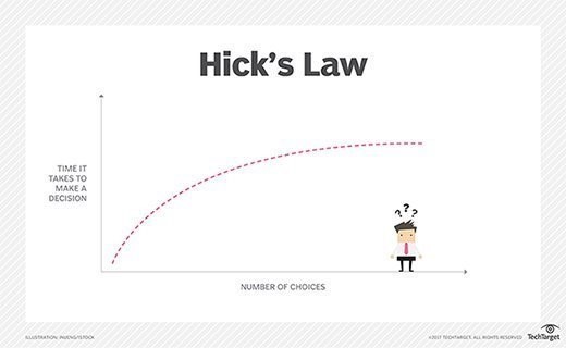
People will take longer to respond to stimuli if several ones are happening at the same time. Additionally, it can be sufficient to prevent them from making any decision at all in the case of a website.
Your visitors will be able to take a break and reflect on what they’re viewing if you leave space surrounding each section of your website. The decision-making process is slowed but for a positive cause.
It Leads to More Appealing Interfaces
After browsing a website, all it takes is a few seconds to gauge how at ease you’ll be there. You can achieve the ideal contrast between content and space with just the proper amount of White Space.
You must, however, make the call regarding the appropriate ratio. For certain brands, however, an extremely simplistic UI might make the site appear too empty and the brand devoid of value. For some brands, too much White Space is beneficial like Google. However, if you strike the correct balance, your use of White Space may undoubtedly contribute to making a website appear appealing to its intended audience.
It Leads to a Higher Interaction Rate
According to research, the average internet user has an attention span of about 6 seconds, which is even shorter than that of a goldfish (7-8 seconds). By accentuating the CTAs (call to action), effective use of White Space increases the likelihood of interaction and speeds up the transmission of the design’s message to the user.
As designers, it is our responsibility to create channels of communication between the design and users, and white space can help immensely in this regard.
It Simplifies the Use of Websites
Positioning and spacing play a significant role in website design concepts, as you will see if you pay close attention. Applying these design ideas to websites allows you to make intuitive interfaces and user experiences that take advantage of human psychology.
The white space around the text, links, and CTA button enhances more than just the aesthetics of these sites. They can also increase the user’s click accuracy and confidence.

In addition, the Gestalt psychologists’ Law of Proximity is one of the mechanisms our mind uses to organize visual information in this world of visual chaos. It asserts that items that are close to one another seem similar. White spaces, one of the design concepts that is widely used, aid consumers in making logical sense of the information that is shown to them. For example, layout items can be logically grouped using margins and gutters between grids.
Improves the Tone of Branding & Designing
To define the style of a web page, Micro and Macro White Spaces are used in various ratios. News websites are fantastic examples of sites that rely on Micro white spaces more than Macro White Spaces.
The web pages provide a sense of luxury and refinement because of the extensive usage of large White Spaces. Contradicts that? Visit the Apple or Microsoft websites. Take a look at Google’s Mail, Drive, or Docs if told to ignore marketing websites. Websites that are content-driven, like Medium, make great use of White Space.
It Creates Breathing Space for Users
Look at the pictures below. The straightforward message of a celebration is to be conveyed. Our attention repeatedly jumps from one element to another in the image to the right, including the party poppers, title, text, and balloons. High content load; very little space devoid of an element.
On the other hand, as soon as we glance at the image on the left, the party poppers, title, text, and balloons are all the same. The White Space surrounding the information is what makes it easy on the eyes. It allows us to breathe, gives our eyes a break, and prevents information overload.
The Wrap Up

White space may allude to the emptiness of a webpage, however, it has a lot of significance and purpose. It is a potent design tool, not just a void in the literal sense. The use of white space is a combination of art and science. You can enhance the overall experience for everyone who visits a website by taking control of the spacing. Experience and repetition are the only ways to maintain the ideal amount of white space in the design composition and strike a balance.
White space is a timeless classic in contrast to web design trends, which could only look good or be relevant for a short duration. Just consider how long it has existed and how it has changed over time, moving from Chinese calligraphy to Modernist art, and then to the web.
White space is a necessary component of web designs if you want to make them future-proof. Learn UX/UI Designing in Delhi from a top graphic design institue in Delhi