
When it comes to data analysis, this is a fairly a complex and comprehensive task. Data analysis is a process which involves complex collection of the data and having a deep understanding of collected data. Power Bi makes these tasks easier by providing number of visuals, automated reports and other many tools. After going through this particular Power Bi tutorial, the skills that you will gain are power query for data cleanup, data modelling, introductory Dax and working with various visuals within power bi and overall power bi familiarity.
How to get Power Bi installed?
- We will go to powerbi.microsoft.com , click on the products and then click on Power Bi desktop to get started.

2. Download the free desktop application from Microsoft website and install it on your system.

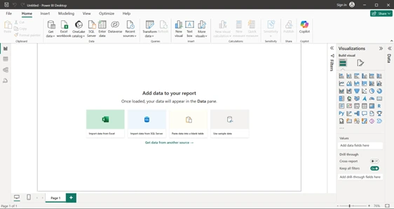
3. Open the power Bi desktop application and you will be greeted with a welcome screen. You might see a login screen as well.
What is Power BI?
Power Bi is a data analysis and visualization software using which we can take data whether it is from Excel workbook, a SQL database server or even paste the data directly into Power Bi for data analysis. This is developed by Microsoft. It helps people to convert raw-data into the information using variety of visuals such as charts, graphs, reports and helps in better decision making.
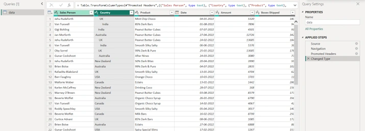
To learn and understand the concept of Power Pi, we have used a fictional data. We will try and apply various operations on this data to have hands on experience.
- Open Power bi desktop and the import data from Excel button here.
2. Then, a navigator screen will appear asking you what data you want in the spreadsheet.

3. Click on the Excel button and point to the file that you have downloaded.

4. Select the data Tab and click on the load button. This way we have successfully loaded our data in Power Bi.

5. Power Bi also gives you an option to transform the data. This option is helpful when your data is not exactly the way you want or organised. This is also used to clean up the data before doing any analysis.
6. After loading the data, a prompt saying build visuals with your data will appear.

7. Your loaded data will show up in the fields panel.

Now, let us understand the various components of the screen before we make visuals within Power Bi.
Major Components of Power Bi
The Power Bi screen is divided into three main areas.
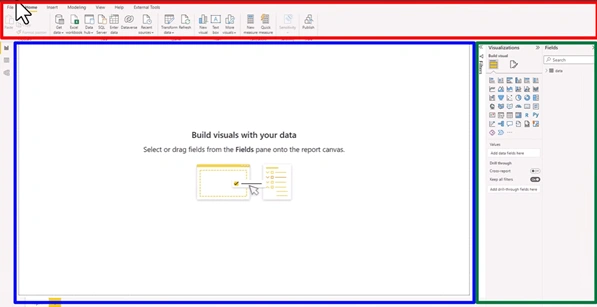
- We have got a ribbon on the top which is useful for accessing various features of the application. If you have used any tool like Excel or Outlook, the ribbon functionality is almost similar to them.
This ribbon is used to switch between different options. Depending on what else you are trying to do, some new ribbons may also appear.
2. The second biggest area is your “Canvas area”. This is denoted with the dotted lines and this is where our visuals, charts, tables and analysis will appear.

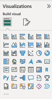
3. The Third important component is the right-hand side panels. These are the panels that you will use to build visuals or change things about data.

For example: You can use the “visualization panel” to insert a graph or any other visual likewise the “fields panel” is used to access all the data points.
4. There is a tiny bar that shows different options for you to switch between different views.

How to create our Create out first Visual
Let’s just build our very first chart and then we will go and understand how everything works.
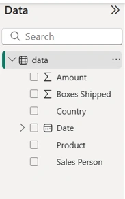
- As in the fields panel, there exist the data button and when we click on data, we will see all the columns of data are existing or displaying there.

Example 1
In this, we will try to visualize that how many number of bo1xes are shipped by different countries.
- To analyse this, column chart looks more useful.
- Click on the column chart to insert it on the canvas.

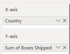
- In the visualization panel, we will drag and drop the data we want on our X-Axis and Y-axis.

- X-axis is the horizontal axis and will drop country data on X-axis.
- On to the Y-axis, we will add the column boxes shipped.
- After adding data to the axis, we will get a number of boxes shipped by each country.

- This visual shows that Australia has the most boxes shipped and New Zealand has the lowest boxes shipped.
- When you create these visuals, Power Bi automatically arranges them in the descending order of the data.
How to change colour of the visual:
- If you want to change the default blue colour of this column chart, we have to follow these steps:
- Firstly, we will select the column chart or any visual you want to change colour of.
- Go to the visualizations area and click on the “format your visual” option on the top.

- Then, go to the columns and the pick the colour of your choice to be shown in the visual.

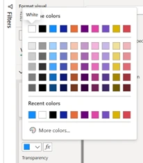
- This is how colour of visual will change.

Example 2:
- Add one more visual to the screen and we will how things are happening by individual product.
- Add a bar chart on the canvas will analysis data in some other dimensions this time.
- Click on the bar chart and add it on the screen.
- Power Bi places the visual in any available space on the canvas. You can resize it and move it around.
- On Y-axis, we will place products and on X-axis, we want to see boxes shipped again.

How Power Bi works?
Here comes the first major difference of power Bi.
- If you click on a specific country for example Australia, you can see that instantly all the Australia related boxer shipments by product are highlighted.

- This is a powerful and default feature of Power Bi. This particular feature is called interaction where every visual is interactive by default. When you point your mouse on the visual, Power Bi will show you a helpful tool tip there to help you understand what is going on.

Apart from columns and bars, you can use any of the other visuals to analyse the data.
Example 3:
If you want to see the trend of shipments over a period of time or how much amount we made over a period of time, we can use a visual called line chart.
- We will add a line chart on the canvas.

- In the line chart, we will place date on the x-axis and add amount to the y-axis.
In Power Bi, date is a special type of data. Whenever you use a date, it will create a hierarchy and on the same date you can also check your data at yearly, quarterly, monthly or on day level.
- We thought, we will get a line but we can see a single dot here. This is all because of the date hierarchy.
Whenever there is a hierarchy involved, Power Bi also shows some extra buttons on the top of the visual to go down at different levels and analyse data.
- If you this pitchfork button, it will take data to analyse on different levels.

For example: Power bi will show all the data added up at year level, monthly, and quarterly basis every time we click on the pitchfork button.
You can see the data at a quarterly level and go down once more if you click the button. Monthly Variations will also be shown by the amount.


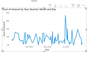
This is how you can use a line graph to visualize things.
AI powered Data Analysis feature of Power Bi
Let us take a situation that you have presented this chart to your boss and he/she suddenly asks you why did the sales drop in the month of March?
For this, you don’t have to do further analysis.
- Right click on that point(march) and then a menu bar will appear.
- Choose the ‘analyse button’ and then click on ‘explain the decrease’ option.

- By doing this Power Bi can do some artificial intelligence and machine learning analysis of your data automatically.


- We can also add on the canvas by using add button.

- Now, we have prepared a page of analysis.

How to clean-up the Data?
If you have created any visual and there appears and blank bar in the chart along with the rest of the parameters then it is quite concerning.

This is the time where we have to go and examine the data.
Go to the workbook from where you have loaded out data and check whether some inconsistent spacing are present in the columns or not.

This is why we are facing this problem.
You have two option to solve this issue.
- You can change the data in the original workbook, clean it up and then power bi will get the correct data.
After doing this, blank will no longer appear in our visual.
- We can clean the data at the Power Bi level as well.
To do this at Power Bi level, we have to do the following steps:
- From the home ribbon, go to the ‘transform data’ option.
- This will open up a separate screen and this screen is called power query editor.
Power query is the data processing engine of Power Bi. Using power query, we are able to tell power bi how we would like our data to be processed, cleaned or reshaped.
- To remove these extra spaces in the beginning or in the end, we have to perform an operation called trimming.
- We will right click on the particular column, choose transform button and then click trim.

- This will clean up the spaces on that particular column.
- When you do these changes, none of the data in your original excel file changes. Power Bi will simply add a rule at its level saying that whenever there is a space, just remove it.
- This is a very powerful automation feature built into power bi.
- You can just close and apply to commit these changes to the data.
- Following all these steps will help you to remove the blank removed.
How to save the Analysis Report?
- To save this analysis report, we have to follow the following steps:
- We can also use the save button on the left-hand corner or from the file option.
- After clicking the file option, click save.

- When you save the Power Bi file, it will save in your computer and you can give the file any name of your choice.
How to share this report?
- To share this Power Bi report with another colleague or a person in your organization, you need to use the publish button.

- This is where you have to login to Power Bi in order to be able to do that.

If you go back to the Microsoft website, you’ll see that apart from the free Power Bi desktop software, they also have a Pro and a Premium package using which you can share and collaborate with others whenever you do the data analysis.
This is how within large organizations or small organizations people use Power Bi. They use the pro-option or a premium option to create content and share it with others so that other people can enjoy the reports or files that you have produced.
We have come so far in this journey and covered a lot more topics. If you are a beginner just starting with a tool like Power Bi, this tutorial will surely help you to clear your basic concepts. For the further more understanding of this tool, you can also join offline data analysis course in Delhi or online Power Bi course from the website. For any kind of help, you can take help from the mentors of ESS institute.