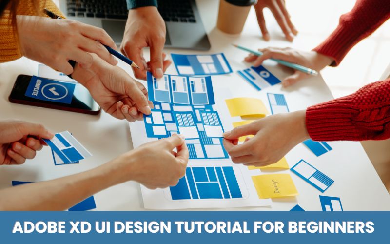
Are you looking to get started in UI design? A trainer from the top graphic designing institute in Delhi will be discussing what UI design is and how to set up your first interface in Adobe XD?
All right, think about your favorite app like Facebook, Tinder or whatever applications do you like and when you first download it and how it look probably pretty easy for you to navigate. Right, it does not take hours to figure it out.
Well, a UI designer uses stylistic elements like spacing and colors and patterns to guide the user through the product in a really natural way.
What is UI design?
UI design refers to the visual design of any application interface. It’s the process of creating interfaces for apps or websites with a focus on a few looks, colors, typography, design elements like buttons and form-fields, dropdowns and interaction designs such as animations and prototyping.
What’s the difference between UI and UX design?
These are often used interchangeably and they shouldn’t be. They’re not the same thing.
UX designers focus on improving the usability as well as accessibility of a product while, UI designers think about how to make the look and feel of a product enjoyable to the user.
UX designers draw a map out of the product, while UI designers flesh it out with visual and interactive touch points. UX and UI designers work together to improve responsiveness, efficiency and accessibility of a product.
How to use Adobe XD?
Set up your first art board in Adobe XD
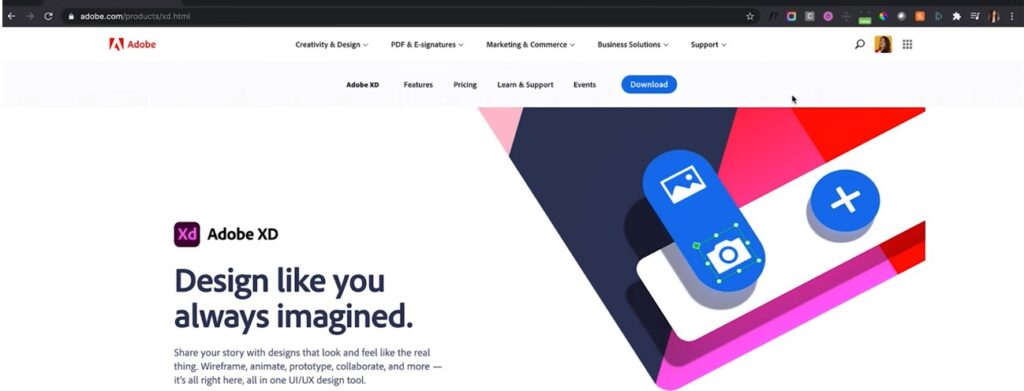
First thing that you’re going to do is download Adobe XD and you can do that just on the website “Adobe.com” by hitting the download button and it’s available for Mac OS as well as Windows users.
If you already have an account on it, you can directly sign-in and if don’t, you can sign-up with your Google account. Once you’ve downloaded Adobe XD, you can go ahead and start a new project.
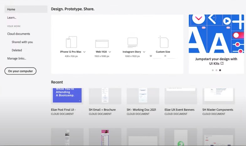
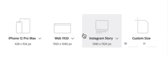
You’re going to see a screen like this with some options up here. You can select them according to your preferences.
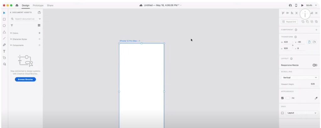
This will be going to open up my first design file, which will already going to set the art board into my design file here.
This is your first art board and where it’s placed is in this huge gray area this is called pasteboard and this is where all of your art boards are going to live.

Now, when we’re designing we don’t just have random rectangles and circles all around this big gray area. We want to make sure all of those design elements that are all contained into this space that has the right dimensions for us.
The Next thing we will show you is the toolbar here on the left hand side.
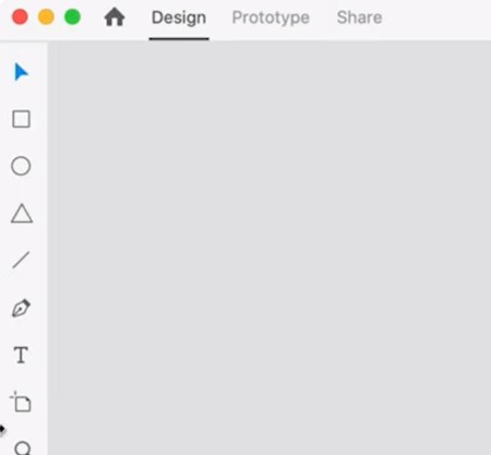
The first option is “SELECT.” This is already enabled here and will allow us to select a layer and move it about etc.
The next option under that is rectangle again the shortcut for that is “R”. We can select rectangle and can create a rectangle onto our art board. Rest we can see a lot of figures and features down below like pen tool, text, and art-board with which we can create more of our choices.
Property inspector
If we select a particular layer like this “rectangle” over here on the right hand side you will be able to navigate property inspector. This will allow you guys to make adjustments to that particular layer.
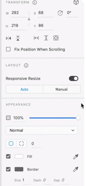
When you select a particular layer, you’re going to see the property inspector change depending on what I’ve selected so this is a contextual menu that changes depending on the layer.
We can change out the color, borders, width and some other properties we want to change accordingly. Let’s play around with some of the features of art board. We used “A” as the shortcut to access art board from here on the toolbar right. If we want to draw any kind of perfect shape, just hold down shift to maintain the same width on each side.
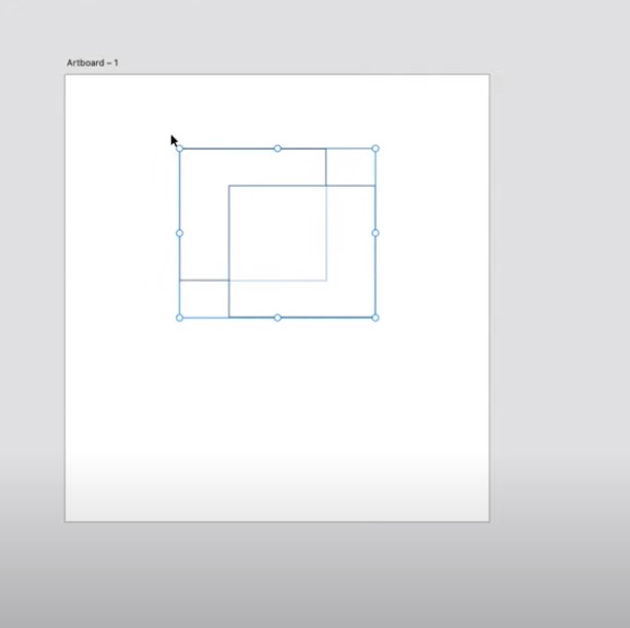
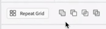
Next, we are going to explore a great property from the property inspector that is Boolean functions. If you think about some of the most well-known logos, they are actually formed by reducing shapes to couple of basic shapes with the help of Boolean functions.
There are four types of Boolean operations that you can do in Adobe XD. You need to have a few shapes in order to enable these functions. Come, let try hands on it
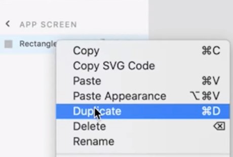
Get a couple of shapes on the board say rectangle for now. We will be selecting it and copy and paste another one.
You can also duplicate the object present of your screen by simply going to the layers panel on the left hand side.
-
- We just going to select them both together and will go over onto the right side in my property inspector.
-
- At the very top, we have our Boolean functions.
-
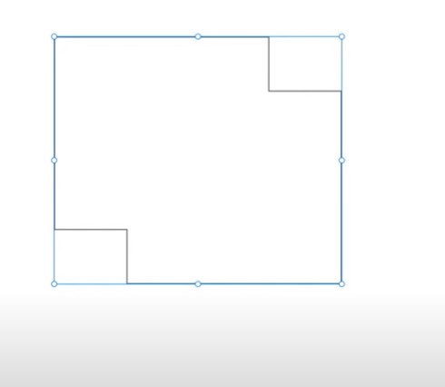
- Union: Two rectangles here will combine together to create one solid shape.
-
- SUBTRACT: If i select the second one, it deletes the top shape from the shape below.
-
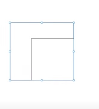
- INTERSECT: It only displays the overlapping areas of different shapes.
-
- EXCLUDE OVERLAP: This function shows everything but the overlapping areas will be removed.
If you guys want to edit the dimensions of the shape you have been drawn, you can do it manually by entering the desired values in the property panel. For the radius of the shape you can use the hollow and filled button on the corners of the shape and from the property inspector also.
Design typography in UI Design
You will learn, how good typography will establish a strong visual hierarchy, build trust in your users and helps you solidify your branding. The right typography harmonizes with the other components on the interface. It also kind of invites the user to understand what their next step is and ultimately help them accomplish their goal. The most important characteristics of typography are clarity and readability. Now let’s look at some of the key elements of typography the first is fonts and typefaces.
A typeface is a family of related fonts while a font refers to the widths the weights and the styles that constitute a typeface. For example: Arial is a typeface and Arial bold is a font.
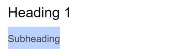
Typographical hierarchy is the process of using, sizing, colors, contrast and alignment to guide the users on what they should pay attention to first. For example: size your headings will be quite large but your subheadings are going to be smaller than that and your body text is going to be even smaller than that.
Contrast
Contrast helps you to emphasize which messages and ideas you want the user to pay special attention to.
For example: if you have a darker and bolder font, users are going to pay more attention to that.
Consistency
If you avoid a very cluttered and messy interface, this will going to establish a consistent hierarchy for your typography.
All of your headings and all of your body copies stay consistent throughout the experience.
White space
White space also known as negative space, it typically goes unnoticed by the users but it’s pretty vital in establishing hierarchy and also making sure it’s an uncluttered interface.
Alignment
Alignment is the process of unifying and composing text, graphics and images to ensure equal space, sizing and distance between each element. For example: aligning your text to the right is going to seem really counter-intuitive for people who read left to right.
Typesetting
Let us look at how we apply the text and these principles to the digital interface with typesetting.
UI designers spend a lot of time to compose the text and to adjust the spacing between letters and lines. This art of arranging text is called typesetting. For this exercise we’ll focus on three fundamental techniques that you’ll need to typeset your text.
-
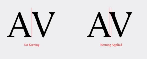
- The first is kerning and it’s the practice of adjusting the spacing between each character which will make it feel really evenly distributed.
-
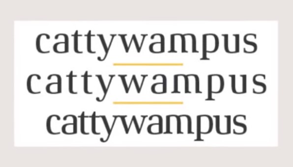
- Tracking is more concerned with the spacing between the words. Making sure that they don’t feel like too close together or too far apart.
-
- Leading is the practice of adjusting the space between the lines of text. Let’s focus on how you actually choose the fonts for your interface.
-
- First consideration is to reflect on the personality and tone. Think about your chosen app and intended audience. How do you want them to feel when they’re interacting with your app?
-
- Once you’ve answered this question, it’ll kind of help to narrow down the interface options and help you to choose a font that really reflects the type of feeling you want your users to have.
Stick to one typeface
Now it might be tempting to use a bunch of different types of typefaces but that is what going to make the whole app feel really cluttered. Sticking to one interface type will help to achieve a more cohesive look and feel. Ideally your chosen typography will have enough range so that you can choose your primary and secondary fonts.
Your primary font is going to be used for all of your larger text like your headings. Your secondary font is going to be used more for buttons as well as your body text.
-
- When choosing a font especially, the secondary font readability is super important. Some of the most readable SERIF fonts are times new roman and Georgia.
-
- Some of the most readable SANS SERIF FONTS are Helvetica, Futura and Arial.
All right, now for the practical part let’s start putting some of that text into our screens.
-
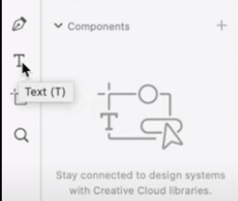
- Go into the toolbar, on the left hand side and click on the text tool.
-
- Click into my art board.
-
- Next we will put my heading title. You can also change some of the attributes of this text. For this, we will be going to double click to highlight all of the text.
-
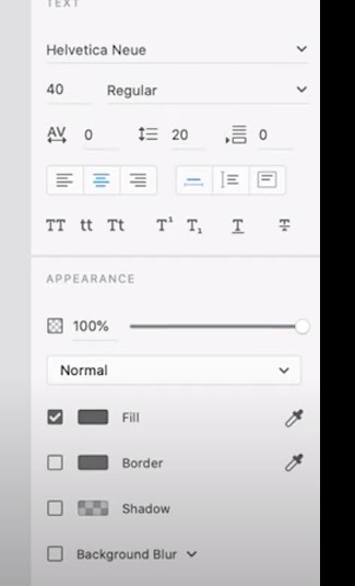
- We are going to change the font size, here so underneath where it says Helvetica New, is the font size. We will change that to 40. You can also change it to bold text.
-
- Align the text in the center of the art board.
-
- This is going to be the most eye-catching text on the screen.
-
- Now, we will be going to add subtext by going back into the toolbar.
-
- Click on text button and this time instead of just clicking into the art board, I’m going to make a rectangle by dragging which allows us to set the width constraints for this text area.
-
- We will paste the desired text and can always edit it from the property inspector in the text section.
-
- This is how we can add text to our art board and do some of the basic important changes from the property inspector.
Keep going!
-
- Explore tutorials and resources available online.
-
- Practice regularly to improve your skills and familiarity with Adobe XD.
-
- Experiment with different design techniques and stay updated with new features
- You can also join the best Graphic design institute in Delhi and Learn UI design with XD