UI UX design is the process of making the experience for the client on an application as Rich, smooth and practical as possible. UX stands for user experience and UI stands for user interface. Although they’re mentioned together but they are not the same thing. UX designers take a more functional approach. They tend to focus on the flow of the application. For example: Does the navigation on the app feel logical and consider things like these only.
UI designers take a more aesthetic approach. Their ambition boils down to how the application looks which includes transitions, interface animations, and graphical locations of components. Both UX and UI designers are vital in the creation of any application or project. Here, we are going to discuss most frequently asked UI/UX designe job interview questions during interviews. I have listed some down many of them.
1. Explain the layout of HTML?
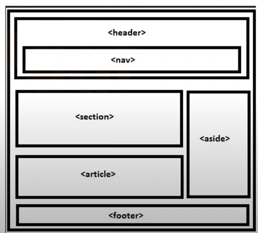
The HTML layout defines how a web page will be organized. HTML 5 elements are used to define various parts of a web page. These include:
- Header: This defines the header for a section.
- Nav: This defines a container for navigation links.
- Section: This defines a section in a document.
- Article: This defines a self-contained independent article.
- Aside: This defines stuff that is aside from the content for example sidebar.
- Footer: This defines the footer of a document.
2. What is the importance of semantic elements?
Some of the reasons semantic elements are important are as follows:
- The use of semantic element improves the readability of the code.
- When semantic elements are used, developers search engines and assistive technologies can better understand the content and context of a website.
- Semantic elements improve code consistency.
3. How do you reduce the load time of a page?
We can shorten the page load Time by doing the following:
- Image compression
- Getting rid of unnecessary images
- Reduce lookups
- Reduce the number of redirects
- Caching
4. How do you assess a product’s UI UX user experience?
Start sharing prototype to a closed set of users and get their feedback. Assess user journeys in the UX of your product and see if user is able to access the products, first time users can be able to convert into permanent users or not. This is a repeatitive process which goes beyond assessment before launching MVPs. Your MVP helps to check user retention rate, your assessment should have a goal to increase retention. Try to analyse the speed and user engagement to decide further on next steps.
5. What websites or apps are your favourite and why?
OR
Mention your preferred apps and websites and explain why you like them. What features make them appealing to customers and do they inspire you as an example?
As an example, we consider the following:
- Google: Google is a prime example of a well-designed functional UX. A single search field is a great customer friendly feature.
- Netflix: A simple service that uses an algorithm to recommend content based on the user’s viewing history. This AIDS in providing the user with a personalized and easily understandable interface.
- Duolingo: This app makes learning enjoyable. The entire interface is gamified giving users the impression that they are playing a game rather than learning.
6. What fundamental differences exist between creating for desktop and creating for mobile?
You can talk about the following differences:
Screen size: There is a clear distinction between desktop and Mobile screen sizes. This has an impact on the layout design. Desktop apps can have fixed navigation bars whereas mobile menus must rely on pull out menus.
Interaction: While desktop computers can fully utilize the cursor’s interactivity, mobile apps do not. In mobile apps users must use gestures such as swiping, or shaking.
Organizing content: In desktop apps, we can use the multi-column format which provides far too many layout and positioning options. Scrawling is the only option for mobile apps.
Desktops are preferred for longer more involved tasks whereas mobiles are preferred for shorter tasks.
7. What is your go to UX design tools?
You can discuss the ones with whom you are most at ease. Here are a few examples:
- Figma: Figma is one of the most popular tools among designer that comes in handy for wire Framing and prototypes. It allows good collaboration and it works well on all platform and supports comment. It also improves accessibility for UX designers. So, while choosing any tool, we see its usefulness, how easy it is to share the tools with others and how well the tool integrates with the way you have already used. Check the figma tutorial for aspiring designers,
- Envision Studio: UX designers can use Envision Studio to quickly create functional prototypes and share them with the team.
- Adobe XD: It gives users a vector-based system for creating prototypes.
- Framer: It is very powerful design tool which can be used to create interactive and responsive prototypes. It has built-in code feature for Advanced animations.
- Notion: It is again great for collaborative design documentation. You can collaborate with other designers also and which can also integrate with the design tool for streamline workflows.
8. What do you mean by AB testing?
AB testing Compares two version of a web page or application to see which performs better by splitting user traffic and analysing the result. So, if you’re a user designer there’s nothing more valuable than understanding how the user wants an application to look in a specific manner. AB testing is a standard method used to understand the user preferences. For example: every company uses AB testing to improve design recommendation and user experience.
The benefits of AB testing are as follows:
- Increases user engagement: AB testing helps designer to create user-friendly interfaces that enhances the user engagement.
- Reduces the bounce rate: It allows designer to identify and address the usability issues that causes users to leave a website or application. By understanding the user’s behaviour and improving the content, the designer can of course reduce the bounce rate and improve the overall experience.
- Conversion rate: AB testing can significantly impact the conversion rate by refining the design element that drive the conversion.
9. What is a prototype and what different types of prototypes you create during a design process.?
A prototype is a rough version of a product to test designs idea before the full development. It as a simplified version that lets you know if things are working as planned or not without putting too much time or money into it.
It identifies design flow early, saves the time, test user flow and interaction.
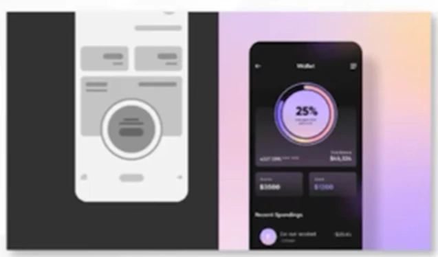
There are three main types of prototypes.
- Low fidelity
- Medium Fidelity
- High Fidelity
Low Fidelity:
Hand-drawn sketches to visualize ideas. Quick, cheap, and focuses on basic layout and flow.
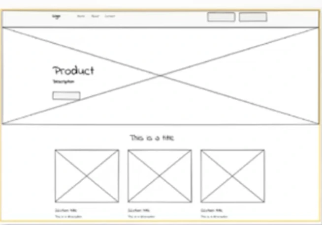
Medium-fidelity prototype:
Interactive prototype with clickable buttons. Tests flow and structure without full design details.
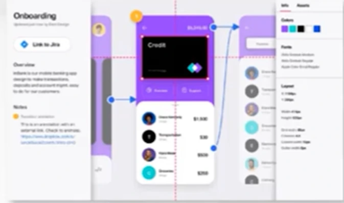
High-fidelity prototype:
Looks and feel like the real product. High-level interactivity and detail to simulate final user experience.
10. What are the laws in UI/UX that can help you guide through the design process?
UI/UX laws are essentially the design principle that help guide the creation of intuitive user-friendly digital experiences. These laws act as a toolkit that helps you create design that are easy for users to navigate and understand. Instead of Reinventing the whole wheel from the scratch you can rely on these proven guidelines to ensure that your designs choices make sense to users. It will reduce your frustration and lead more enjoyable interaction when you will apply these laws correctly. These will help make digital production that not only look good but also functions efficiently. Here is list of 5 of them:
Hick’s Law
It works on the principle that the time it takes to make a decision increases with the number and complexity of choices.
Tip: Keep it simple, limit options.
Fitts’s Law
The time to reach a target is based on the distance to the target and its size.
Tip: More important buttons big and close.
Gestalt Principles
Principle: People groups relatable items together.
Tip: Organize similar content clearly.
high fidelity prototype in ui
Principle: The average person can only remember about 7 items at a time.
Tip: Avoid overwhelming users with so much of information.
Jakob’s Law
Principle: Users spend most of their time on other sites, so they expect your site to work in a familiar way that is people prefer familiar interfaces.
Tip: Stick to common design patterns.
11. What’s the importance of responsive design, and how do you make sure that your designs are responsive?
Responsive design ensures that a website or app functions well on various devices and different screen sizes. I apply relative units like percentages and EMS for responsive elements, create flexible grid layouts, and set breakpoints. Prototypes can also be tested across a variety of devices to identify and fix display problems. Learn more about mobile friendly web apps in our offline responsive web development course institute.
12. What are some of most significant trends in UX design in your opinion?
Name a few popular trends that have impacted UX design in a positive way. The interviewer is trying to check whether you keep up with the trends and if they impact Your Design as well. Some of the trends that have become very popular are Personalized User Experiences, Voice and Conversational UI, AI-Powered Design, Augmented Reality (AR) and Virtual Reality (VR), Data-Driven UX and some others. Explore User Interface in our online UI development course in Hindi.
13. How can you conduct UX evaluation?
UX evaluation or user experience evaluation is a process used to assess how well a product like a website, an application or any system meets the need of user. It’s a crucial process that helps designer to understand whether a product is hitting the mark or need some modification. This is where UX evaluation comes.
Below are the steps to evaluate your product:
- Identify the target product. This could be website an app. Example a food delivery app.
- Determine the questions to be answered like specs of people who will use it, who will use it, user journeys
- Plan the methods like how the user journey can be simplified. What is better for payment designs.
- Collect and analyse data
- Revise as per data regularly
14. What is the importance of IA in UI design?
Information architecture organises content to ensure it is structured, accessible and easy to navigate.
The key importance of IA is:
- Enhances user experience: Organized structure helps users find information easily.
- Improves usability: Ensures logical navigation and better interaction flow.
- Supports Visual design: Provides the foundation for UI layout and element placement.
- Guides user behaviour: Helps users intuitively navigate the interface.
15. What are some common UI UX design principles?
UX design is creative process that involves user research, and prototyping. It is a multidisciplinary field which involves creating product that provide meaningful and relevant experience to users.
These design principles were made so that there is no conflict between two individuals while designing something. They benefits design team to design better and work more collaboratively.
Key UX principles are:
- Clarity: Ensure the interface is easy to understand
- Simplicity: Keep the design clean and free from unnecessary elements.
- Hierarchy: Organize content by important using size, colour, or placement.
- Consistency: Maintain uniform design elements for a cohesive experience.
- Feedback: Provide immediate responses to user actions (e.g. notifications).
- Accessibility: Design for all users, including those with disabilities.
- User Control: Offer control with features like undo or clear navigation.
- Affordance: Design elements should visually indicate their function (e.g. clickable buttons)
16. How to create a responsive layout in Figma?
You have to design a screen that will be able to adapt different screen sizes.
Constraints:
In Figma Constraints are used to tell how layers should respond when you resize the frame. To make your design responsive, you have to scale according to different device screen sizes.

On the left-hand side, click on the layer you want to make responsive.
A section for constraints will appear on the right-side panel.
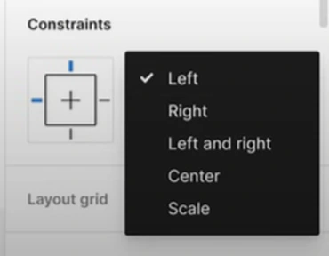
Click on the menu and select bottom to lock the “bottom” and next one to “centre” to scale the screen efficiently. This is what we exactly want when we talk about responsiveness.
17. Design a Low-Fidelity Wireframe for a New Feature.
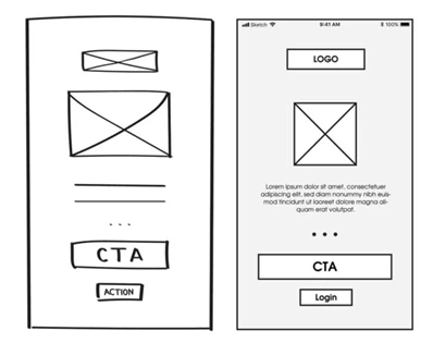
You can try to begin this question by first identifying the key areas for which you are creating this wireframe. For example: in case of any e learning platform, it could be course topics or duration of course. Sketch a simple layout using pen and paper with search bar and use checkboxes for filters. Keep you design structured and user friendly.
While making a low fidelity wireframe, the core objective is on structure rather than detailed design. It a s skeleton where each element will appear providing a basic idea of what you will going to create.
18. Describe a challenge that you faced and how you handled it?
While answering this question, it’s really good to think about this and pick one or two situations that you’ve faced that were challenging. Even if you made a bad decision or failed in the outcome that you were hoping to achieve, that’s fine. They’re willing to hear things like you can admit your mistakes and can pivot and change your ideas when you know you’re on the wrong track.
For example: You can answer this question by referring to a story. Here is a sample example.
There was a project I worked on years ago where we thought we were on the right track and about to launch a new product. We had done user research, multiple concepting stages, and also been collaborative in the workplace. We were done with building prototypes and tested them. Then, we realized at the last minute that we had built our prototypes and done our user research on the wrong topics. We were about to launch this product that was supposed to solve a problem. We realized we had mis defined the problem and we were solving the wrong thing. This was a huge crisis in the team and the company. We all felt like failures and we were afraid to admit it and figure out what we should do next. The way that we moved forward as a team was to acknowledge that we’d made a mistake that would affect the success of our launch. We needed to delay, hold back, and reassess the whole thing to almost start from scratch. We used what we had and reframed the whole thing differently.
19. How can you use colour to make your UI UX design projects look elegant.?
To pick colours for my designs, I really avoid using very Loud and obnoxious ones which could be distracting for the viewers. As a guideline for myself, I have distributed the colour usages percentage out of 100. For example: I prefer to use 60% of our neutral or base whether it could be creamy colour, or a white colour, 30 % of primary colours and rest of the 10 % is for secondary colour which is used to emphasis call-to-action things.
You can also visualize things by looking at the picture we have shown below. The second one is more elegant and neutralized version of previous one.
20. Can you provide an example of how colour choices influence user emotions and decisions on a landing page?
While reviewing charity landing pages, I noticed that they strategically use specific colours to influence our emotions and actions. For example, these pages prominently feature orange and red, with a neutral background to emphasize the call-to-action buttons. The colour red is used to represent urgency and energy, encouraging users to act quickly. In contrast, orange creates a sense of warmth and compassion, resonating with the empathy-driven nature of charitable giving. The neutral background colours maintain a clean, uncluttered look, helping the warm-toned call-to-action stand out more effectively.
21. What are the essential elements of an effective landing page, and how do they contribute to user engagement?
There are several important elements which works together to make a landing page effective and engaging for users. The page should have a clear headline, compelling value proportion, a very strong call to action button and visuals such as images or videos to make the page more engaging.
An effective landing page has several key elements that work together to engage users and encourage action. These key elements all together creates a smooth and focused experience for the users.
22. What role does whitespace play on a landing page?
When whitespace is used intentionally and effectively, it makes it easier for your users to scan the design because it improves visual hierarchy and increases easy cognitive processing.
- The spacing is just too tight and there’s not enough whitespace between the elements, making it quite difficult to read.
- There are two ways to achieve a balanced amount of whitespace.
- One, use a consistent spacing system when designing components in your design and second is to utilize the proximity principle.
- Consistent spacing system: This means your spacing around elements should be in increments of a consistent number. Using a consistent spacing system will make the elements look more considered and harmonious with each other.
- Proximity: This means Appling less spacing around elements that are related to one another and more spacing around unrelated elements.
- Whitespace is an effective principle to achieve a balanced design, making it easier for your users to scan and read.
23. How do you manage pixel-perfect designs when working with responsive frameworks?
We should focus that the core designs should be scalable or responsive which can be done using percentages, viewport width, and media queries.
For example, we can reduce an 80px margin on desktop to 20px on mobile to make everything readable and visually balanced. We should also prioritize using flexible layouts that easily make sure that the icons, texts, and space automatically adapts to different screen sizes for a better experience. This approach makes design look fine and easy to navigate through different screens.
24. How would you optimize the placement of a CTA button on a landing page to maximize conversions?
We should ensure the things listed below
- Place it Above the Fold
- Use Contrasting Colours
- Repeat the CTA
- Make It Clear and Specific
If you still need any further help or want to prepare yourself for interviews well, you can reach out to our skilled mentors in ESS Computer Institute Delhi. You can also brush up your concepts all again by just joining an UI design or UX design course from our institute to land a UI UX designer job quickly. We know the learning curve is quite steep but our team is constantly working to make things easier to learn for all of you.
Keep learning/ keep growing.
